Wednesday, May 25, 2011

Cut Off the Top

Hello Lords and Ladies, here is my showreel, innit.


You can is does watch it in HD on Vimeo, I recommend that.

Tuesday, March 29, 2011

Monday, March 21, 2011

Sunday, March 20, 2011

Thursday, March 10, 2011

Wednesday, February 23, 2011

True Colours

Just some compositing tests. First shot is something that I asked Andy to test, to find out whether we could drain the colour from a scene in a dramatic way. I personally think it's a rather pleasing effect.

Note: We definitely did NOT need nor accept any help from Alan Matthewman. Thanks Alan.

The second video is more composite tests on that moon shot. Not quite sitting right with me, seems rather too busy/messy now [Although that translucent cape is well tasty] Will sort it.


BYE.

Tuesday, February 22, 2011

Standing in the Rain

Quick test to see if Sian's rain works.


It does. Jolly good! Also some lovely cape and character animation by Rory Hinks.

Sunday, December 12, 2010

Nice New Outfit


Pre-Production Bible and Animatic, evaluation of the term to come later.

Inbetween:aFable Animatic from Jake_Jones on Vimeo.

Monday, December 6, 2010

Tannhauser/ Derive

So, the character design for the Gypsy King has had to undergo a series of changes over the weekend.
Both Derek and Kathy brought to my attention that the King looked less like a monarch and more akin to a beggar.

Initially, I had intended for the King to represent subversive authority, influenced by Mikhail Bakhtin's King of Fools theory; Regalia dethroned, high culture and ideals decanted. Which is why he was designed to appear like a pauper, one of the great unwashed. However, as we worked through my storyboard it became apparent that having such a key character represented in this way, and relying on pre-cursory knowledge for the complex encoding of the character is a sure-fire way to alienate my audience. And although I am keen to get the audience thinking and contemplating what they've just watched, I don't want to leave them feeling disoriented, I want them to be able to work the film out without research.

So, instead of looking at Royalty of various cultures to influence the design I considered a more spiritual or tribal approach to the aesthetic. I wanted to keep the carnival essence and aesthetic to the design, and distinguish him as a leader of people, with-out the decadence of existing and representative royalty.

It is frustrating that the design has had to change, especially since Rory spent quite some time working on adapting the existing King designs for animation, but it seems as though it is a necessary change, particularly if I want to tell the story successfully.

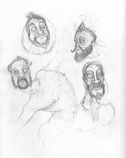
So, for your viewing pleasure, are some sketches, and a rough approximation of something that I might possibly be happy with at some point I suppose.


I do like the design developments actually, I think I have managed to avoid elevating the character to that sense of self importance and extravagance exhibited by most representations of Royalty - in animation or otherwise.


On another note (no pun intended) take a listen to THIS.

The first 90 seconds of music are a gorgeous string piece that I can really see being a huge influence on the music for my animation. I've loved the arrangement since I discovered it several years ago, the conflict between the violin and cello is so evocative, it has a mournful darkness, but also an urgency and severity that I feel would meld with the images and words in the animation beautifully.

If you don't know Refused, and like aggressive music (or if you don't), check them out - they can be a bit difficult or challenging to listen to at first, but I find as a musician, listening to their music is constantly rewarding.

Ok, let's have fun.


Friday, December 3, 2010

Odalisque


Life drawing from the last term, just trying to get back into it really, although I did spend the most recent session experimenting with inks a little, trying to exaggerate, loosen up and emulate the great Ralph Steadman.


These are some digital paintings I made a while ago, from photo reference, in order to improve my light and colour theory. It's a helpful technique, and I'm likely to produce some more (in downtime, of course).

That's all for now, chaps.

Wednesday, December 1, 2010

Tonight My Wife Is Your Wife

So, it's been a few weeks since the pitches etc. and the people who've had their projects chosen spent the first week running around fervently attempting to get people into bed with them.

Currently sharing my proverbial duvet are:

The enigmatic Rory Hinks - who has been working away very successfully as lead animator, but will also aid in design, and has helped to adapt some of the character designs for animation. As have I.

The illustrious Kat Michaelides - who is chiefly working on the animation layouts and backgrounds, and basically saving me architecturally. But will also help with animation further down the pipeline.

The fearsome....? Orla McElroy - who I have gladly taken on as a producer, to keep my mind focused and kick me around when I'm lazy, and help with scheduling next term. She essentially told me I was managing my time/work flow completely wrong. Which I was.

And the (recently) poetic Holly Tselikova - who is also lending her considerable talent to me as an animator, though not as a permanent position, as she is - quite understandably - attempting to work on as many projects as humanly possible for her.

All of this motley bunch are dividing their time between several projects, but I am very happy with the amount of time that each one is able to dedicate to my project, and I'm delighted with the standard of work that has been produced so far.

As Animation Director, I obviously don't have to do anything. Ever. I just witness events occurring. And boss people around.
By which I mean I've been working away at the storyboard and cinematography, and working on the animatic. I've also spent the last half a week trying to procure a suitable voice actor, with a lot of help from a very generous contact, which at the moment seems to be really paying off. But more about that later.


some character adaptations/turnarounds


And since kat hasn't updated her blog :P, some of her background ideas.

Have also been working on writing some music for the animation. Which is perhaps a little premature, as it's early days, but it all counts.

That's it for now, I'll update with some influences and evaluation/more pre-production sometime soon.

Just found some lucozade. Bonus.

Saturday, October 16, 2010

Strength In Numbers

They're so organised......

I've finished working with Simon Acty's group for now. After some initial general design, I was tasked with designing the one of the protagonist characters for their project. It was interesting to just be given a job to do that was specific to me, but in aid of someone else. It certainly presents a lot less to preoccupy you, and it gives one the opportunity to focus and refine the design more.

Here are some of the broader more generalised designs that I started on.


Then I was tasked with designing the character who serves as apprentice to the Hunter, and is in some ways more the protagonist that the Hunter.

The idea was to create somebody who looks physically very pathetic, in terms of bodily strength and size i.e. somebody very frail and thin, or a small, overweight child. However, the weakness is something that would be made a joke of, in as much as he would be forced to carry a monstrous amount of gear regardless, like a malnourished donkey.

It was also decided that the apprentice should be male - to fit as an appropriate relationship between him and the hunter - and in his mid to late teens, still not a fully grown man, but perhaps old enough to be sent to work for money to send to his family.

Here are the designs/development.


I'm pretty happy with the design, there are a few issues with the mechanical arm, mainly to do with rigging and animating a working model, but it is an aspect that is removable. However, I feel as though it would be a shame to lose it, as I feel it adds a little more interest to the character, and helps him to fit into the steampunk aesthetic that the group have gone for.

I still need to draw up some of the bags and other props as turnarounds, but for now I can get on with my own project.


Appalling Colour Mockup

Saturday, October 9, 2010

When The Faction's Fractioned

There were a lot of good ideas pitched yesterday, including a few that I would have an interest in working on. The problem is finding the crew members and convincing them to commit to yours. I am keen to build a portfolio of character design and animation this year [regardless of medium] and have already committed to assist Simon Acty's group as a part time crew member, helping with design, and possibly some animation further down the pipe-line, and would like to assist in a few others. However - and I find it unlikely that I do not share the sentiment with others - I would be disappointed were I not able to facilitate the workforce necessary to pursue my own directorial aspirations.

I am aware that yesterday I explained my idea in a very poor and perhaps confusing way, so I felt it made sense to upload the micro-proposal that we had to upload last night for general reading pleasure.

The project that I am proposing to make for the final year is a short film – 4-5 minutes in length – that is based on and accompanied by a poem that I am writing currently entitled In-between.

Basic Synopsis

The basic story behind the poem and animation revolves around a female protagonist and her encounter with a fictional, medieval town inhabited by traveling gypsies/carnival folk. A self righteous and pious individual, her judgement upon the inhabitants of the town (whom she views as monsters and degenerates) is severe. The gypsies enjoy the base pleasures in life – what renaissance writers might refer to as the grotesque – eating, drinking, sleeping and sex, and though these base pleasures are also the core survival instincts in a human being, our protagonist considers the town and it's inhabitants to be a pit of sin, no more than predatory, primitive beasts. In attempt to purge the town of it's “sickness”, she begins a violent and bloody crusade, policing the town by systematically murdering the sinners as she sees fit. In an attempt to cut the head from the beast, she slashes a path towards the gypsy king. Efforts to combat her take the shape of a resistance formed by vengeful members of the community intent on ceasing her crusade and baying for her blood. After her murder of the gypsy king, she is confronted by the mob, clearly outnumbered. This is a grey area in the story as the protagonist needs to have a crystallising moment in which she realises that she has made herself into more of a demon than the people she is massacring. This particular moment has not been figured out yet, but it needs to be an act that shows that humanity is so much more complex than right and wrong, dark and light, that humanity is all the shades in between. After her epiphany, she is left alone, racked with guilt, her belief system shaken to core.

Themes Involved

I would like to make it clear that this not meant to be an attack on religious beliefs or offend people who choose follow any particular faith as a harmless but important part of their life. It is more meant to highlight the danger of extremist methods within belief systems that harks back even as far as if not further than the Crusades. Methods such as war, genocide, indoctrination, and qualities like ignorance and closed mindedness. I think it's a particularly relevant subject in these times in which people are so desperately fearful of certain religions or cultures, purely based on the actions of relatively small extremist groups, or when others mislead potential believers to the point of endangering their lives, just to “save their souls”.

The point is that the extremist is not inherently evil, they do not believe their goal to be selfish, nor do they believe they are doing anything wrong, which is why initially we will empathise with the Crusader protagonist to begin with, and see the townsfolk as she does, but later we see a switch of perspective, and that wrong and right is simply not so clear cut. That the ability to make a choice has moral ambiguity in itself, and that morality is subject to the individual to interpret, which makes one human.

Method

The method used to create the animation will be 2D cel animation, traditional hand drawn, and computer assisted. The poem will narrate the action but the animation will compliment the narration rather than be a literal, demonstrative visual aid.

Wednesday, October 6, 2010

Your New Aesthetic

Back to school.

Here are some recent concepts/sketches that I have produced to develop My idea for the graduation film, which to explain briefly will be an animation accompanied by a narrative poem that I am writing.


Saturday, June 12, 2010

After the Rush Hour


Buh. Brain death noted.

So it is done, 2 thirds of the way through our course. Although we technically have a little bit of a wind down period before our official end of year now... But it's nice not to feel guilty about sleeping.

Negotiated uploaded on Thursday at about 10:50 I believe, that was another looong night. Sod the timeline that I said I would upload, you can just have a goosey gander at a few of the finished stills from the hand in piece.

I know the model is not fantastic and I did sort of have to rush it a bit at the end, but I would find it difficult not to be pleased with the amount that I have achieved and learned. I was an ambitious novice, and I feel as though I managed to deliver on my brief. Albeit that that the quality is not as high in particular areas as I was hoping – certainly it is not as adept a job as some of my contemporaries may be capable of - and there are some rudimentary mistakes which are disappointing to me, but I had to pay a time sacrifice somewhere. To have learned as much as I have is satisfying enough.


Tuesday, June 8, 2010


Here are the poses/final concept for Heracles
The model is not complete - clearly - and the poses are not final, it was just to see if I could move the topology around successfully. I would love to texture this feller up in the style that I've painted him, so maybe that can be a little summer project...... As well all the other things I intend to set myself.....

The Approaching Curve.


Learning curve. For me the negotiated brief has been a monstrous learning curve. The last time that I tried to model anything at all was my own face for Georg's Masterclass. Before that it was the environment that we all had to do last year. Fun.

However, I have seriously enjoyed modelling so far, and I have learned an invaluable amount. My only qualm is that I wish that I had known how much I would throw myself into some of the other projects -- The pitch, as well as working right up to the bleeding edge on the third year projects, in the studio til 7am for Will's -- I think that I would have been less ambitious with the negotiated. For somebody with a very basic knowledge of 3D modelling, I drew up a complex modelling project that I really wish I had more time to work on.
It's pretty clear to me that I'm not going to hand in a finished representation of what I wanted to hand in, as Georg pointed out to me, a high quality result in this project would most likely be at the expense of another project. Sadly, the time sacrifice has been made on this project. I'd like more time, but rules is rules, I was meant to be out of my comfort zone, and to push myself to learn a new skill. I am going to finish the model, just after the hand-in, I want to take this to the end and develop my skills in area that I was previously weak in.

Anyway, the screens are various parts of the model as they are currently, and a quick pose test, the next post will be a visual time line of how this project panned out for me.